Redesigning Cuningham's Lead-Driven Architecture Digital Portfolio
Agency: Chromatic
Role: Account + Design Lead
Year: 2025-present
Client: Cuningham Architectural Group
Summary
As Account Lead at Chromatic, I worked with Cuningham to strengthen confidence in their primary and fastest-growing lead-generation channel: their website. Coming off a difficult experience with a previous vendor, the internal team needed clarity, momentum, and a partner who could translate high-level brand goals into concrete, measurable improvements. My role focused on rebuilding trust in the platform by aligning design, content, and user experience around how prospective clients actually evaluate architectural partners.
The work was not framed as a cosmetic refresh. It was about helping the site communicate credibility, humanity, and regional expertise in ways that supported both business development and brand integrity.
Though I use “design” a lot in the case study, it should be noted that I not only provided UX/UI design but as the Account Lead on this project I also served as strategy, project manager (for a back-end/devOps and additional front-end engineers), as well as full-stack implementation and maintenance support.
Designing for Lead Generation and Trust
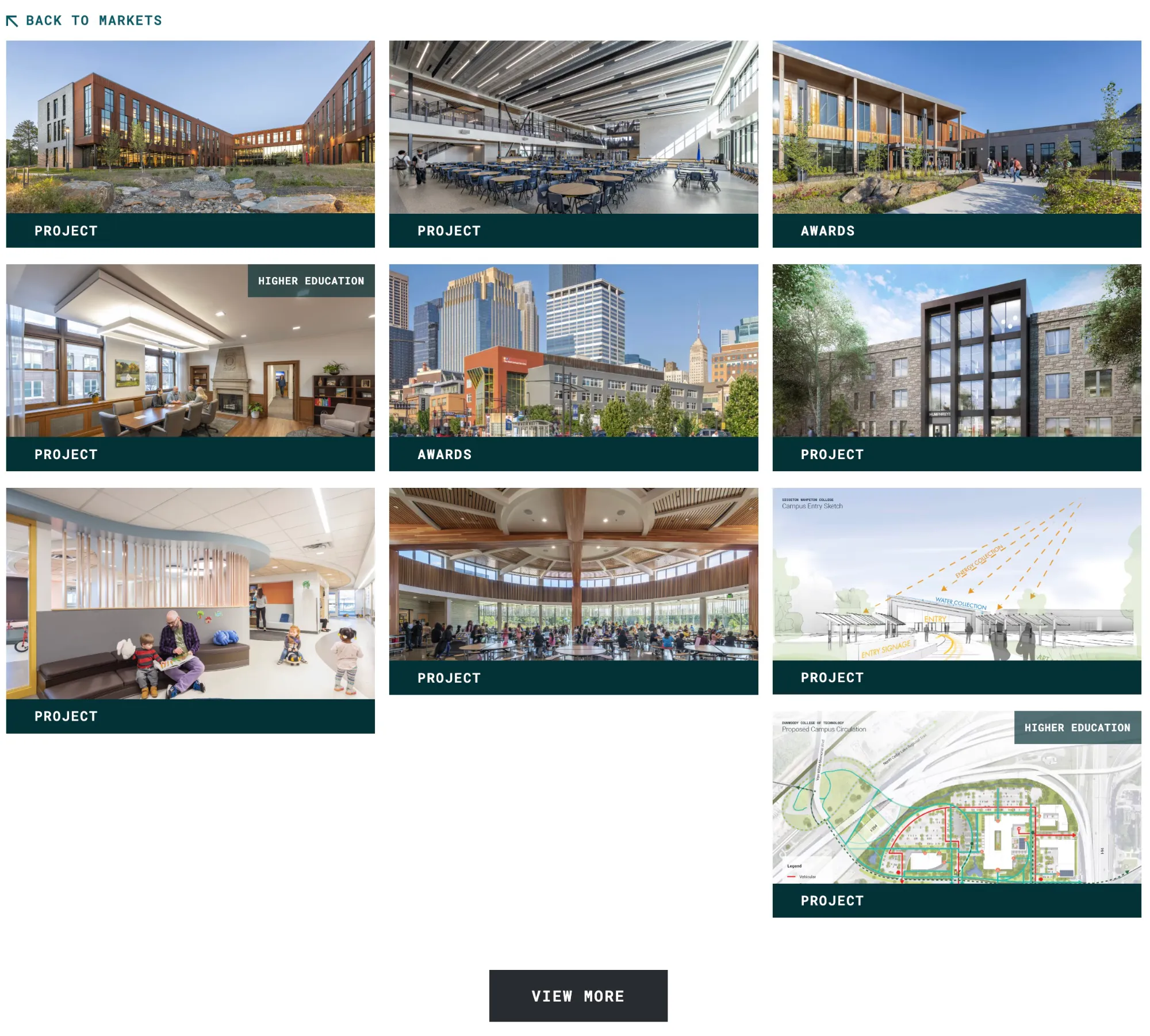
A major focus of the engagement was redesigning key sections of the site to better support lead generation without resorting to aggressive or generic conversion patterns. Based on real use data via Cuningham’s simultaneous services (HubSpot and Google Analytics) and stakeholder interviews, I audited how users moved through the site, where intent naturally formed, and where the existing experience failed to reinforce confidence.
From there, I redesigned core page types and flows to make it easier for prospective clients to understand who Cuningham is, what they stand for, and how to take the next step. Calls to action were clarified and contextualized, not amplified. The goal was to meet users at the moment they were ready to engage, rather than forcing conversion prematurely.
Re-Centering the Human Factor Through Leadership Pages
One of the most impactful changes I led was a rethinking of the leadership and people sections of the site. Previously, leaders were presented primarily as functional roles within the firm. I redesigned these sections to foreground the humanity of the individuals — their perspectives, experience, and personal presence — rather than positioning them as interchangeable parts of a larger machine.
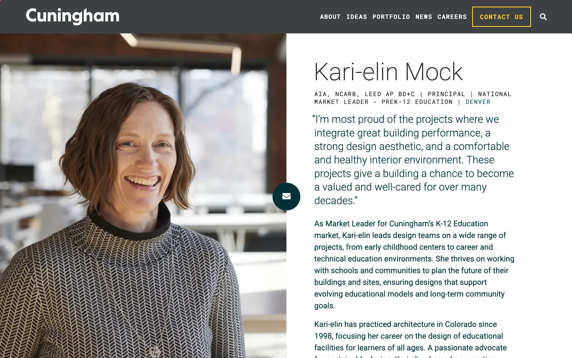
This shift helped reinforce trust and relatability, particularly for clients selecting long-term architectural partners. The leadership pages became a proof point for culture and values, not just credentials.
Proving the Group’s Location Reach
I also redesigned the location-based sections of the site to better tie regional presence to demonstrated knowledge and expertise. Rather than treating locations as static office listings, these pages were reframed to show how Cuningham’s work, relationships, and experience vary by region.
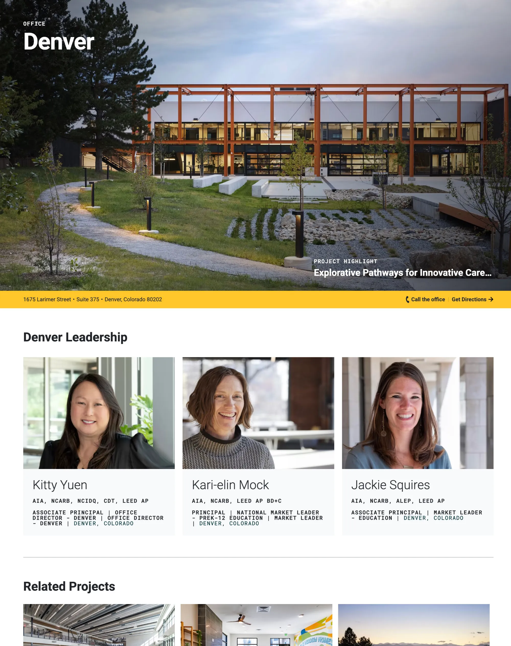
This approach strengthened local credibility while still supporting the firm’s national identity. For prospective clients, it created a clearer connection between geography and expertise — an important signal in a field where regional context matters deeply.
Brand Parity, Accessibility, and Visual Refinement
As the project progressed, I worked closely with the team to refine color usage, visual hierarchy, and typographic treatment across the site. These refinements emphasized brand parity, accessibility, and legibility, ensuring the design system supported both aesthetic goals and real-world usability.
Typography is currently undergoing a broader facelift, and my design work has been structured to accommodate that evolution without requiring disruptive rework. The emphasis throughout has been on systems that can absorb change gracefully rather than resist it.
Ongoing Optimization and Iterative Improvement
The work with Cuningham is intentionally ongoing. I’ve composed and planned optimization tickets that feed directly into development sprints, covering continued refinement of leadership and people pages, deeper treatment of location-based content, bringing the careers section into visual and structural parity, and preparing the site for a broader internal brand redesign.
Rather than treating launch as an endpoint, this approach treats the website as a living system — one that can be measured, adjusted, and improved over time. My role has been to help establish that rhythm and ensure design decisions remain aligned with business goals, accessibility standards, and long-term maintainability.