This block would be used for a catchy headline along with a short summary or command paragraph that would entice the user to progress deeper into a specific flow via the call-to-action below.
call to action - defaultThis block is a variation of the above, in that it allows the editor to add an image to the background. In the process, it changes the font color. Note: This requires the editor select an image will allow the text to continue to be legible over the image (ie., dark enough).
call to action - whiteThis block is a variation of the above, in that it allows the editor to add an image to the background. The difference, however, is the content color and intended background image lightness. As with the above variant, it is importnt to choose the image asset wisely, considering the legibility of text that will overlay it.
call to actionJust as the above component variation was an option within the paragraph component, so too is the background color. Allowing the editor, further, to create variation within the flow of a page, or reuse a pattern for another page or instance/need. In addition, the editor can choose to not include a call to action. DevOps can even build in a color choice selection field so author can choose from a preset list of colors.
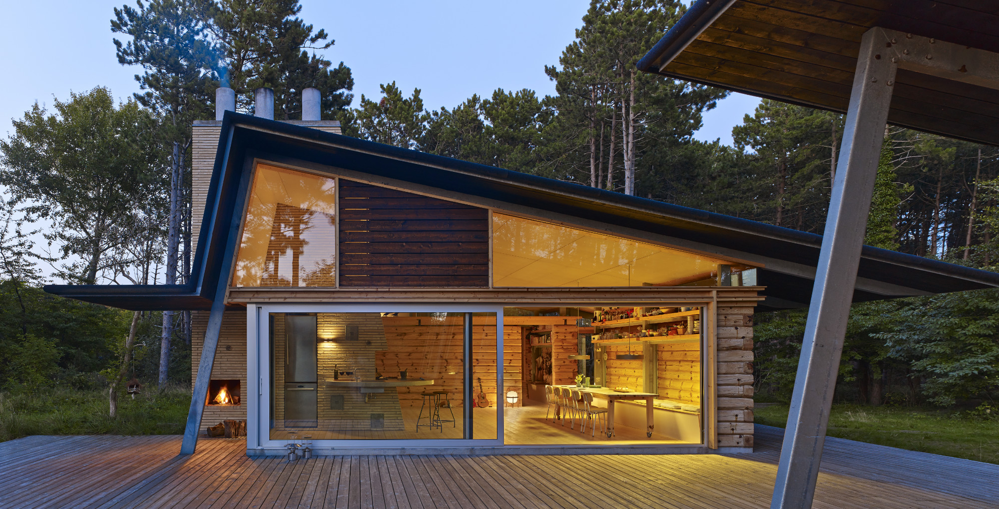
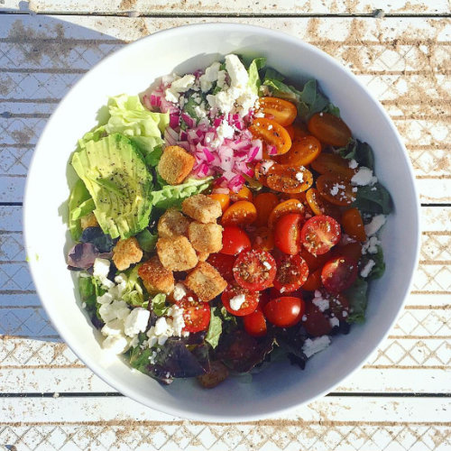
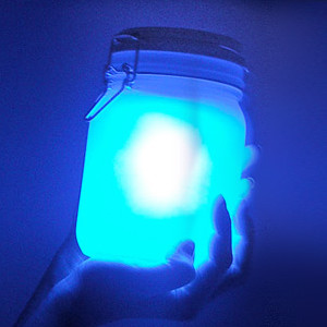
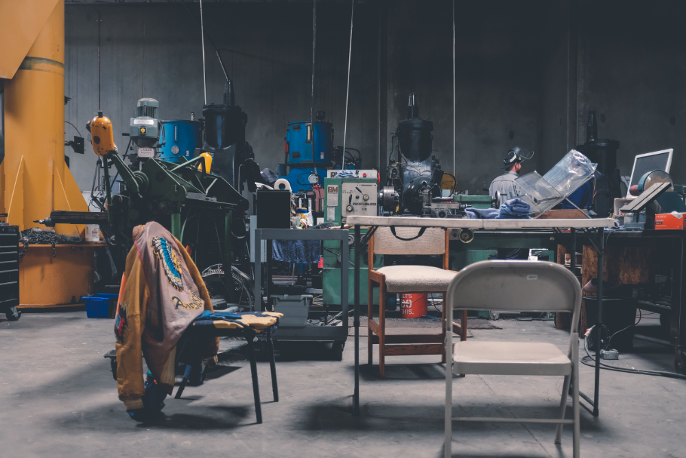
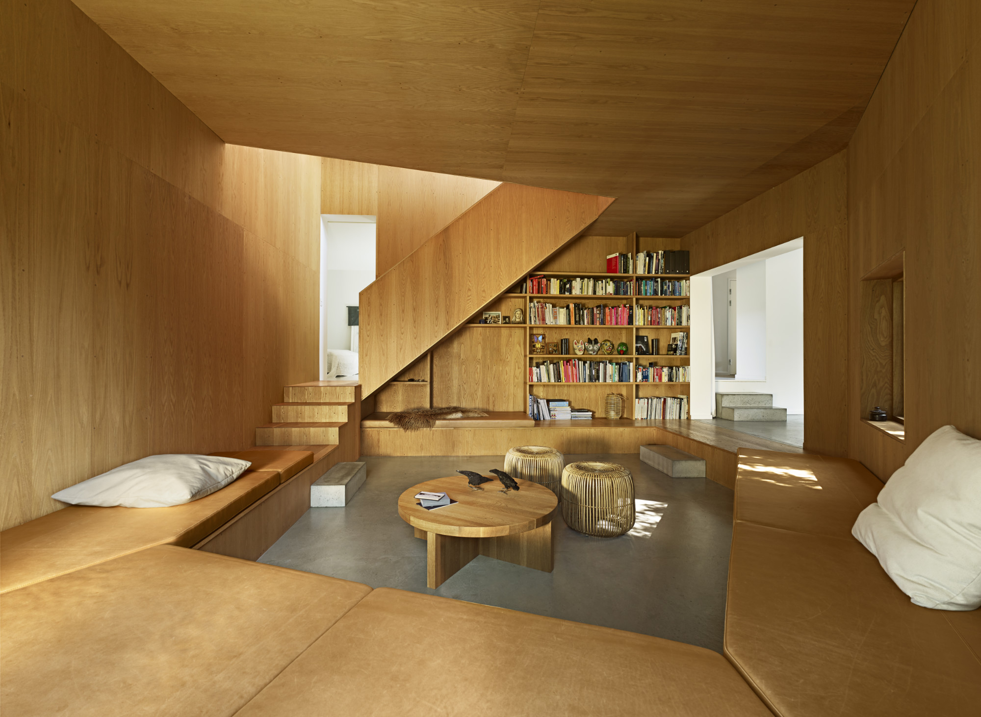
This component takes the rule of thirds to focus on imagery with a supporting description


Variations of this component would include orientation (left, right) and color (dark, light). / Note: The height of the component will be controlled, primarily, by the height of the image asset.
This gives the editor a flexible way to create "tiled" layouts relatively easily. Both the image and text can be swapped, left/right. As well, this makes use of a lighter call to action button.
call to action - lightAs with above, this shows how the editor can change the orientation and image. In addition, the editor can choose to have no call to action, either.

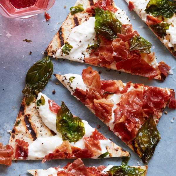
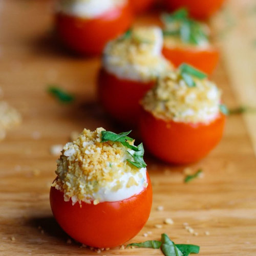
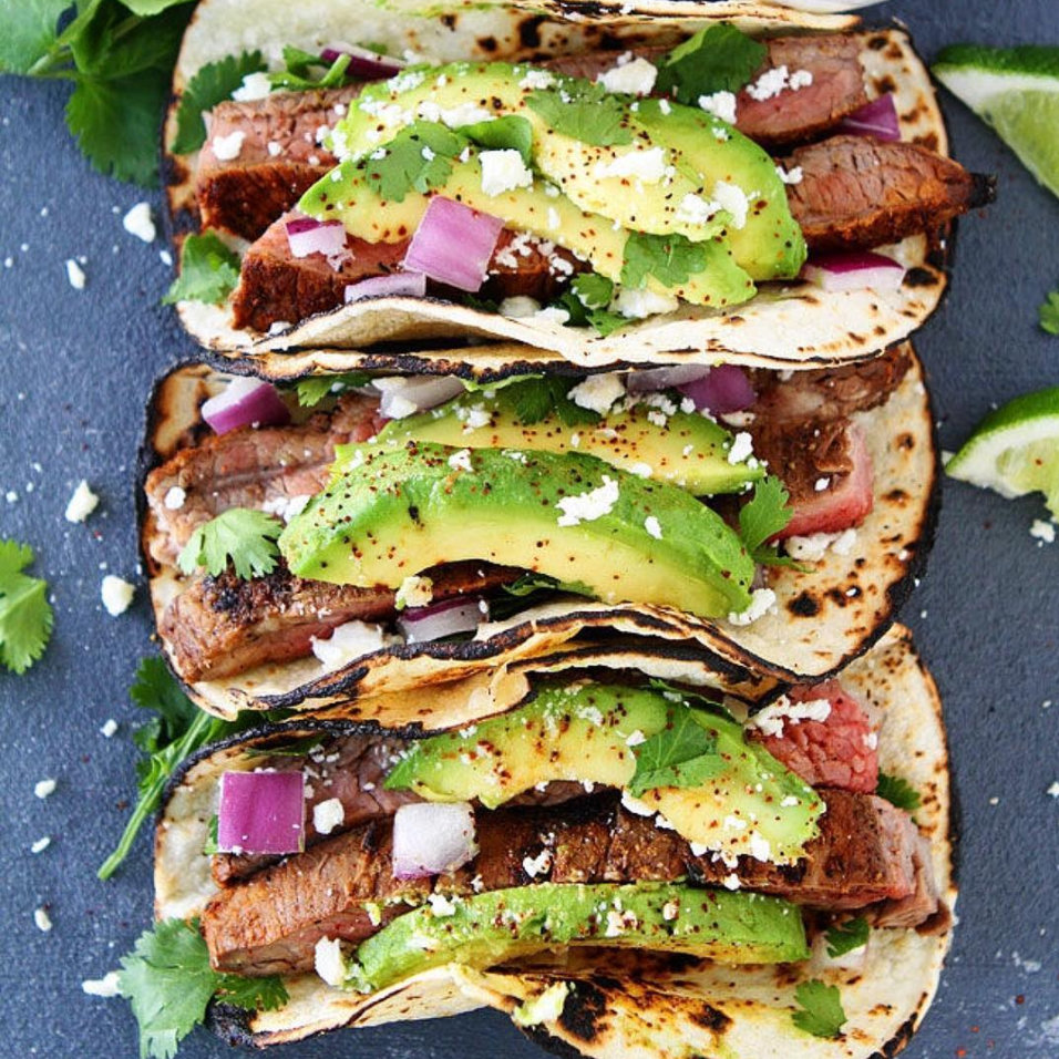
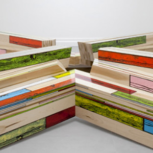
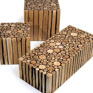
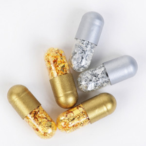
Similar to the Tiles, this component allows multiple instancing use with flexible ease and author management.
call to actionUnlike the above components, authors can create/add/edit as many tiles as they please.
call to action - textIn doing so, the tiles will flex to the situation, maxing out at four columns per row.
If there are less than four per row, they will dynamically center themselves.
Again, these components will allow a header, summary (preferably a single paragraph max), and two choices of button styles (optional). It is important, with these components, to limit your users' interaction. (Too many actions in limited realty causes blindness due to information overload.)
This FPO summary visually shows what a comparatively larger amount of text will look like adjacent smaller neighboring cards. In addition to provisioning two button styles, with this redesign, we suggest limiting the amount of hyperlinked text occurring in small touch-point areas (occurs when you heavily link small bits of large bodies of text).
The WYSIWYG allows authors to generate a wide variety of content-heavy, informative blocks without being restricted to the rest of the layout library components. The WYSIWYG gives access for an unlimited quantity of all major elements: all headers (h1-6), paragraph, images, and any other elements you wish to add during UX discovery. In addition, new elements may be easily added via dev support by way of the Styles palette. These elements, commonly, are concerned with varying paragraph sizes, captions, or floating blocks (image left/right, et cetera).
Lorem ipsum dolor sit amet, consectetur adipiscing elit. Suspendisse varius enim in eros elementum tristique. Duis cursus, mi quis viverra ornare, eros dolor interdum nulla, ut commodo diam libero vitae erat. Aenean faucibus nibh et justo cursus id rutrum lorem imperdiet. Nunc ut sem vitae risus tristique posuere.
Ultricies nec, pellentesque eu, pretium quis, sem. Nulla consequat massa quis enim. Donec pede justo, fringilla vel, aliquet nec, vulputate eget, arcu. In enim justo, rhoncus ut, imperdiet a, venenatis vitae, justo. Nullam dictum felis eu pede mollis pretium. Integer tincidunt. Cras dapibus. Vivamus elementum semper nisi. Aenean vulputate eleifend tellus. Aenean leo ligula, porttitor eu, consequat vitae, eleifend ac, enim. Aliquam lorem ante, dapibus in, viverra quis, feugiat a, tellus. Phasellus viverra nulla ut metus varius laoreet. Quisque rutrum.
Aenean imperdiet. Etiam ultricies nisi vel augue. Curabitur ullamcorper ultricies nisi. Nam eget dui. Etiam rhoncus. Maecenas tempus, tellus eget condimentum rhoncus, sem quam semper libero, sit amet adipiscing sem neque sed ipsum. Nam quam nunc, blandit vel, luctus pulvinar, hendrerit id, lorem. Maecenas nec odio et ante tincidunt tempus. Donec vitae sapien ut libero venenatis faucibus. Nullam quis ante. Etiam sit amet orci eget eros faucibus tincidunt. Duis leo. Sed fringilla mauris sit amet nibh. Donec sodales sagittis magna. Sed consequat, leo eget bibendum sodales, augue velit cursus nunc.
Aenean imperdiet. Etiam ultricies nisi vel augue. Curabitur ullamcorper ultricies nisi. Nam eget dui. Etiam rhoncus. Maecenas tempus, tellus eget condimentum rhoncus, sem quam semper libero, sit amet adipiscing sem neque sed ipsum. Nam quam nunc, blandit vel, luctus pulvinar, hendrerit id, lorem. Maecenas nec odio et ante tincidunt tempus. Donec vitae sapien ut libero venenatis faucibus. Nullam quis ante. Etiam sit amet orci eget eros faucibus tincidunt. Duis leo. Sed fringilla mauris sit amet nibh. Donec sodales sagittis magna. Sed consequat, leo eget bibendum sodales, augue velit cursus nunc.
Aenean imperdiet. Etiam ultricies nisi vel augue. Curabitur ullamcorper ultricies nisi. Nam eget dui. Etiam rhoncus. Maecenas tempus, tellus eget condimentum rhoncus, sem quam semper libero, sit amet adipiscing sem neque sed ipsum. Nam quam nunc, blandit vel, luctus pulvinar, hendrerit id, lorem. Maecenas nec odio et ante tincidunt tempus. Donec vitae sapien ut libero venenatis faucibus. Nullam quis ante. Etiam sit amet orci eget eros faucibus tincidunt. Duis leo. Sed fringilla mauris sit amet nibh. Donec sodales sagittis magna. Sed consequat, leo eget bibendum sodales, augue velit cursus nunc.